How to Draw Your First Pass Map and Shot Map with mplsoccer
From a blank file to a real pass map and shot map, in about forty lines of Python.
If you can read this and run a Python file, you can make the kind of pass map and shot map that show up on broadcast graphics. The data is free, the tools are free, and the whole thing takes about forty lines. We'll map the 2022 World Cup final — Argentina 3–3 France — from a blank file to two finished images.
What you'll need
Two libraries do almost all the work. statsbombpy fetches StatsBomb's free open data; mplsoccer draws football pitches in matplotlib so you never have to plot a penalty arc by hand. Install both:
pip install statsbombpy mplsoccer matplotlib pandasThat's the entire setup. No account, no API key — StatsBomb's open data is genuinely open.
Step 1 — Get a match
StatsBomb's data is organised as competitions → matches → events. An event is anything that happens on the ball: a pass, a shot, a carry, a tackle, each one stamped with a location on a 120×80 pitch. Let's pull the final's events.
from statsbombpy import sb

comps = sb.competitions()
season = comps[(comps.competition_id == 43) & (comps.season_name == "2022")].iloc[0]
matches = sb.matches(competition_id=43, season_id=int(season.season_id))
final = matches[matches.competition_stage == "Final"].iloc[0]   # Argentina vs France

events = sb.events(match_id=int(final.match_id))
print(events.type.value_counts().head())
One detail that trips everyone up at first: StatsBomb records every event so that the team in possession is always attacking toward x = 120. That convention is what makes the maps below line up.
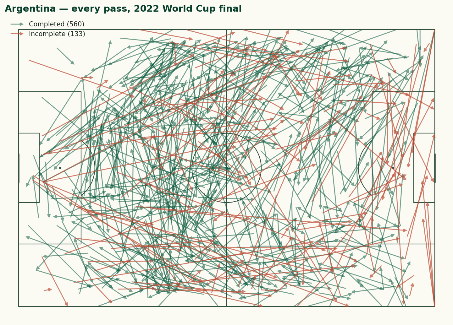
Step 2 — Draw a pass map
A pass map is just an arrow from where each pass started to where it ended. The one rule worth memorising: in StatsBomb data, a pass that has a pass_outcome was incomplete (the outcome records how it failed); a completed pass has no outcome at all, i.e. it's null. So we split on that.
from mplsoccer import Pitch

team = final.home_team                                  # Argentina
passes = events[(events.type == "Pass") & (events.team == team)]
completed = passes[passes.pass_outcome.isna()]          # null outcome = completed

pitch = Pitch(pitch_type="statsbomb", pitch_color="#fbfaf3", line_color="#33503f")
fig, ax = pitch.draw(figsize=(11, 7))
pitch.arrows(completed.location.apply(lambda v: v[0]),
             completed.location.apply(lambda v: v[1]),
             completed.pass_end_location.apply(lambda v: v[0]),
             completed.pass_end_location.apply(lambda v: v[1]),
             ax=ax, color="#0a5a3f", width=1.4, headwidth=4)
fig.savefig("pass-map.png", dpi=150, bbox_inches="tight")
Run it and you get every Argentina pass on one pitch. In the full version of the script (linked below) we draw the incomplete passes in a second colour, which is where a pass map earns its keep — the clay arrows cluster exactly where a team's progression kept breaking down.
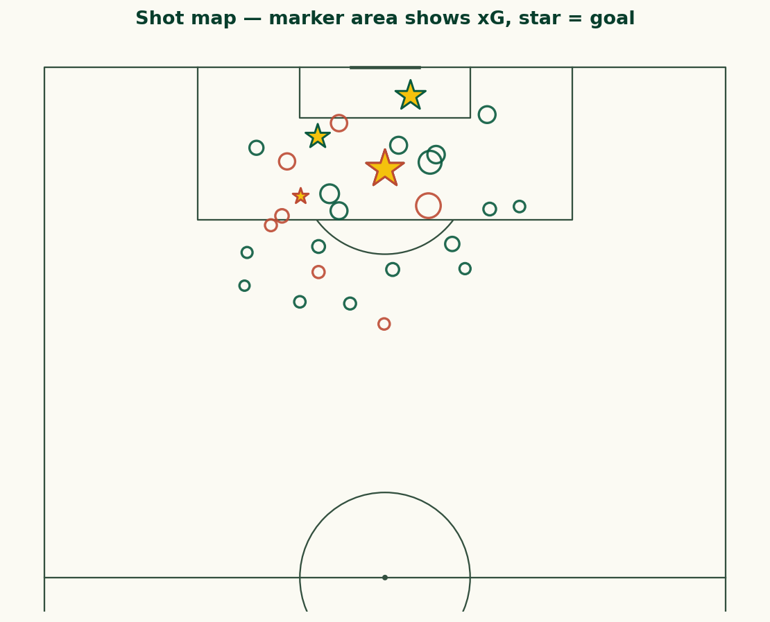
Step 3 — Draw a shot map
For shots we switch to a VerticalPitch with half=True, because shots cluster around one goal and a vertical half-pitch uses the space better. Each shot carries StatsBomb's pre-computed xG in shot_statsbomb_xg, so we size every marker by it — bigger blob, better chance. We drop period 5, the penalty shootout.
from mplsoccer import VerticalPitch

shots = events[(events.type == "Shot") & (events.period != 5)]

pitch = VerticalPitch(pitch_type="statsbomb", half=True,
                      pitch_color="#fbfaf3", line_color="#33503f")
fig, ax = pitch.draw(figsize=(7.5, 8))
pitch.scatter(shots.location.apply(lambda v: v[0]),
              shots.location.apply(lambda v: v[1]),
              s=shots.shot_statsbomb_xg.astype(float) * 900 + 40,
              ax=ax, facecolor="none", edgecolor="#0a5a3f", linewidth=1.6)
fig.savefig("shot-map.png", dpi=150, bbox_inches="tight")
The match had 30 non-shootout shots worth a combined 5.03 xG. Highlighting goals as stars (a one-line change) turns the map into a story: who took the good chances, and who took a lot of bad ones.
One gotcha: the coordinate system
The reason these maps line up without any fiddling is a convention worth understanding before you go further. StatsBomb records locations on a 120×80 grid, and — this is the important part — it normalises every event so that the team in possession is always attacking toward x = 120. When Argentina have the ball their shots cluster near x = 120; when France have it, theirs do too, in the same coordinates. The data does not care which way the teams physically kicked.
That convention is a gift and a trap. It is a gift because a single team's shot map needs no adjustment — filter to the team, plot, done. It is a trap the moment you want both teams on one pitch, because they will pile up on top of each other at the same end. The fix is the one I used for the shot map you would build from the full script: mirror one team by plotting it at (120 - x, 80 - y) so it attacks the opposite goal. Keep that one rule in your head and you will avoid the most common beginner mistake in football data viz: a shot map where every shot is somehow in the same six-yard box.
The other field worth knowing is period: 1 and 2 are the halves, 3 and 4 are extra time, and 5 is the penalty shootout — which is why we filter it out of shot maps, since shootout penalties are not really part of the run of play.
Where to go next
You now have the two building blocks of almost every football visualisation. From here, small changes unlock a lot:
- Filter
passesto one player to see an individual's range, or to one third of the pitch to study build-up. - Swap
pitch.arrowsforpitch.kdeplotto draw a touch heatmap. - Colour passes by whether they progressed the ball, or shots by body part.
- Loop the whole thing over every match in a competition to aggregate a season.
The complete, runnable script behind the images on this page — incomplete passes, goal stars, the house colours — is scripts/draw-your-first-pass-map-and-shot-map-with-mplsoccer.py in this site's repository. Change the competition_id and you're mapping a different tournament before the kettle's boiled.
Sources & further reading
- Free textbook: Chapter 10: Passing Networks and Analysis — the theory behind this, at DataField.dev.
- mplsoccer documentation — pitches, arrows, heatmaps and the full plotting API.
- statsbombpy — the StatsBomb open-data client used here.
- StatsBomb open data — the matches and events themselves, free to use with attribution.