The Knockout Autopsy: Identity Beat Form at the 2026 World Cup
The first piece of the post-tournament series, asked with the whole dataset on the table — which numbers, knowable before kickoff, actually predicted the 2026 knockout bracket? The answer inverts the way most people pick winners, and the champion is the proof.
Now that the tournament is over and the dataset is final, we can ask the retrospective question properly: across the 28 decided knockout games of the 2026 World Cup, what actually predicted the winner? Twelve indicators, one league table, and a result worth the whole exercise: a team’s pre-match possession average called 82% of decided knockouts — nearly matching shots on target measured in the game itself — while entering goals per game, the number every casual prediction leans on, finished dead last at 64%. The tournament didn’t reward form. It rewarded identity.
Sourcing. Every number below is computed from our bundled dataset — all 104 matches of the completed tournament, from ESPN’s public scoreboard and match-summary feeds, served raw at /data/wc2026_results.json. “Entering” indicators are each team’s tournament-to-date per-game averages before kickoff of that knockout game; “in-game” indicators are the box score of the game itself. Ties on an indicator are excluded per comparison, so denominators vary and are printed on every bar. Chart script: charts/chart_wc2026_predictors.py.
The league table of predictors
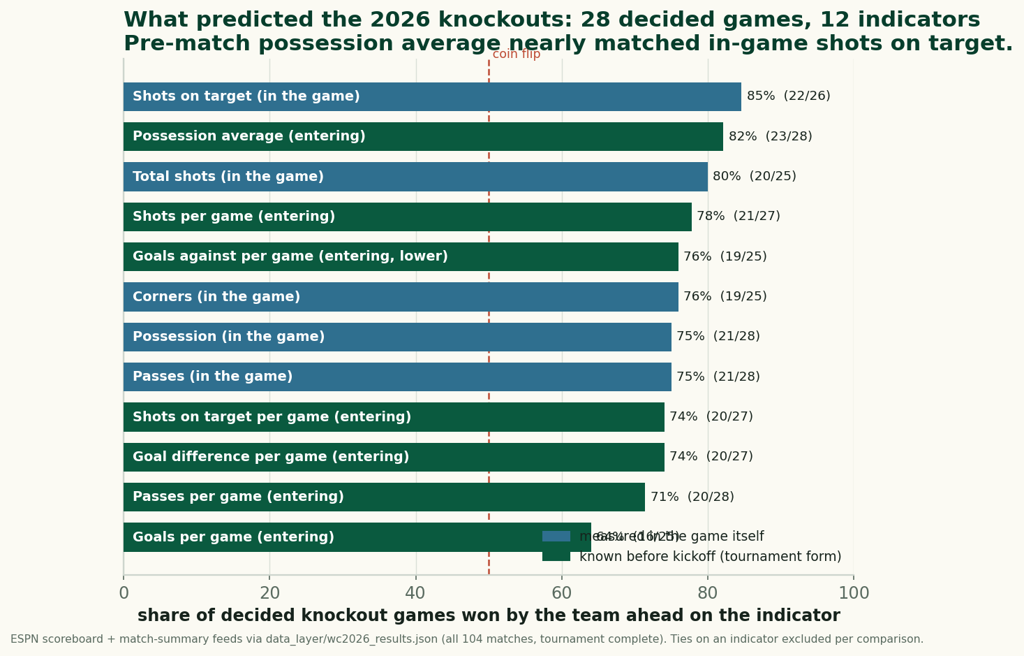
Read the top of that chart carefully, because it’s stranger than it looks. That shots on target led the table is no surprise — this series tracked that pattern all tournament (the familiar 24-of-28 ledger counted teams that matched or beat their opponent on target; today’s 22-of-26 is the strict higher-count version, with two ties set aside — same pattern, tighter definition). But shots on target is measured during the game. It predicts nothing; it describes. The remarkable line is the one just below it: entering possession average, 23 of 28 (82%) — information fully available before kickoff, outperforming every other pre-match indicator and essentially tying the best in-game one.
The possession finding, stress-tested
The five misses are instructive. Three belong to one team: Norway, whose counterpunching run beat higher-possession Ivory Coast and then higher-possession Brazil — the tournament’s designated exception, profiled in its own note. One was Mexico over Ecuador in the round of 32. And the fifth was the bronze final, where England’s 54.1% entering average beat France’s 57.1% in the tournament’s least consequential fixture. Which means: from the quarter-finals onward, the higher-possession-entering team won six of the seven games that produced a winner — and the seventh was the third-place game. The final itself was a hold: Spain entered at 63.8% to Argentina’s 60.7%, and Spain are champions.
Why would a style statistic outpredict every results statistic? The honest answer has two layers. The kind one: possession average is the most stable number in this feed — goals arrive in single digits and lie about small samples, but a team’s share of the ball barely moves game to game, so seven matches of it measures something real about how a team imposes itself. The skeptical one: possession is also a proxy for plain quality — good teams hold the ball and win, and nothing in a who-led-won count separates style from strength. Both layers are true at once. What the table actually establishes is narrower and still useful: among the numbers this feed carries, the stable identity measures aged well, and the volatile scoring measures aged terribly.
How badly goals form aged
Entering goals per game called 16 of 25 — 64%, last place, barely clear of the coin flip line. And the misses aren’t noise at the fringes; they run straight through the podium. Spain, the eventual champion, was the goals-form underdog in two of its own knockout wins — entering the Austria game scoring 1.67 a match to Austria’s 2.00, and entering the Belgium quarter-final at 1.80 to Belgium’s 2.60. Morocco beat higher-scoring Canada; Belgium beat higher-scoring Senegal and the United States. Nine times in twenty-five, the team that had been scoring less advanced anyway. A month of “team X is averaging three a game” television graphics predicted the bracket worse than a possession column nobody puts on screen.
The reason is the one this series kept meeting all tournament: goals are rare events. Seven games of goals is twelve to twenty observations wearing a per-game costume, and group-stage schedules inflate them unevenly — a soft group buys a gaudy scoring average that says little about a quarter-final. Possession comes in continuous percentages every match; goals come in lumps. When you rank indicators by sample stability, you have roughly ranked this chart.
The caveats, stated at full volume
Twenty-eight games is a small book to bet a theory on, and this piece tested twelve indicators against it — with that many comparisons, the spread between 64% and 82% contains real information and real luck, and one different result moves any bar by about four points. The entering averages blend group-stage opposition of wildly different quality. The who-led-won method ignores margins entirely (leading possession by 0.2 points counts the same as by 20). And nothing here is causal — nobody should hoard possession because of this table. What the table earns is a prior for 2030: when you fill in your next bracket, weight who teams are over what they just scored. That prior would have gone 23-for-28 this summer.
This closes the live chapter of the World Cup series and opens the retrospective one — the complete dataset supports slower questions now, and the next ones on the list are how the 48-team format actually redistributed goals, and whether the group stage told us who would survive the bracket. The hub keeps collecting all of it.
Sources
- Match results and team stats: ESPN public scoreboard + match-summary APIs, parsed to
data_layer/wc2026_results.json(all 104 matches, tournament complete); served at /data/wc2026_results.json. All rates computed bycharts/chart_wc2026_predictors.py; ties on an indicator excluded per comparison. - The in-tournament tracking this retrospective formalizes: the final wrap (the 24-of-28 matched-or-beat ledger) and the early what-wins-games note from the group stage.
- The counterexample’s file: Norway’s run, quantified.
- The World Cup hub collects the complete series.
More from World Cup 2026
The 2026 Dark-Horse Audit: Grading Our June Checklist
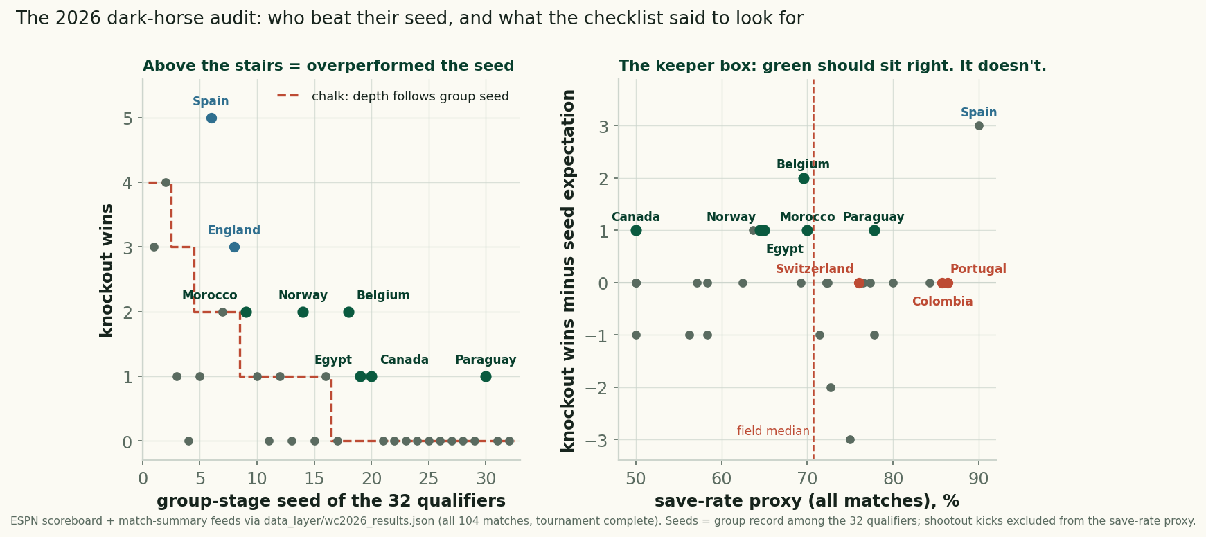
Six teams beat their group seed at the 2026 World Cup, scored against our pre-tournament checklist: the keeper box failed, the kind draw barely helped.
The Shootouts: Rarer, Earlier, and a Reprieve That Never Lasted
Retro #4 closes the series: the shootout rate fell to 12.5% of knockout games from 2022's 31%, all four came early, and survivors went 1-3 next time out.
The Groups Told the Truth: How June Predicted July at the 2026 World Cup
Group-stage points strongly predicted knockout survival: 9-point teams went 3-for-3, 4-point teams 2-for-11, and the last four all ranked top-8.