Build a Tournament xG Tracker in Python: From Match Table to Cumulative Performance
Turn a match-by-match xG table into a running picture of who is really playing well.
In a short tournament, the scoreboard is a liar of convenience. A team can win on a deflected free kick and a penalty shootout, look magnificent in the results column, and be quietly drowning in expected goals. Over seven games that gap rarely closes — the sample is too small for luck to wash out — which is exactly why a running tally of expected goals is the sharpest lens on who is actually playing well. This tutorial builds a tournament xG tracker in Python: feed it a match-by-match table, and it returns each team's cumulative xG for, against, and the difference between them, plus a clean chart of the trend.
Why track xG, not goals
Expected goals (xG) scores each chance by the probability it becomes a goal, so a tap-in counts for most of a goal and a speculative thirty-yarder for a sliver. Summed over a match, a team's xG for and xG against describe the quality of the contest independent of whether the finishing was hot or cold. If you want the full grounding, expected goals explained covers what xG is and is not. The key property for a tournament tracker is stability: goals are noisy over a handful of games, but the underlying chance creation a team racks up is a steadier signal of its level.
Tracking it cumulatively — a running total that grows match by match — turns a scatter of individual games into a trajectory. You can see the exact match where a team's process fell off a cliff, or where an unbeaten run was always built on sand. That trajectory is the thing the scoreboard hides.
The data schema
The tracker reads one row per team per match. Four columns carry the signal: the team, its opponent, the xG it created (xg_for), and the xG it conceded (xg_against). A matchday column keeps the timeline ordered. In production you would export this from your own data source into a CSV and load it with pandas.read_csv.
matchday, team, opponent, xg_for, xg_against
A direct honesty note: the sample table in the code is made up. The 2026 World Cup has not been played — it begins on June 11, 2026 — so there is no real tournament xG to load yet, and inventing "results" would be dishonest. These rows exist only so the script runs. When real matches are played and you have genuine xG, you drop in your own CSV and nothing else changes.
import pandas as pd

# In practice:  df = pd.read_csv("tournament_xg.csv")
#
# --- TOY DATA (invented, NOT real 2026 results) -------------------
# One row per team, per match. Two teams, three matchdays shown.
df = pd.DataFrame([
    # matchday, team,      opponent,  xg_for, xg_against
    (1, "Falcons", "Cranes",    2.10, 0.60),
    (1, "Wolves",  "Stallions", 1.40, 1.10),
    (2, "Falcons", "Wolves",    1.30, 1.25),
    (2, "Cranes",  "Stallions", 0.90, 1.00),
    (3, "Falcons", "Stallions", 2.40, 0.40),
    (3, "Wolves",  "Cranes",    1.05, 1.20),
], columns=["matchday", "team", "opponent", "xg_for", "xg_against"])
Computing cumulative xG
The core transformation is a grouped cumulative sum. Sort by matchday so the timeline is correct, group by team, and run cumsum on the two xG columns. The xG difference per row — xG for minus xG against, the single most useful summary — accumulates the same way. The mechanics of that for-minus-against logic, applied to a league table, are spelled out in build an xG-difference league table; here we apply them across a tournament timeline.
df = df.sort_values(["team", "matchday"]).reset_index(drop=True)

# Per-match xG difference, then running totals within each team.
df["xg_diff"] = df["xg_for"] - df["xg_against"]

grouped = df.groupby("team")
df["cum_xg_for"]     = grouped["xg_for"].cumsum()
df["cum_xg_against"] = grouped["xg_against"].cumsum()
df["cum_xg_diff"]    = grouped["xg_diff"].cumsum()

print(df[["matchday", "team", "cum_xg_for",
          "cum_xg_against", "cum_xg_diff"]].round(2))
Each team now carries a running xG-for, xG-against, and xG-difference after every match it has played. Because cumsum respects the within-group order, the totals are correct as long as the data was sorted by matchday first — a small detail that is easy to get wrong and produces silently scrambled numbers if you skip the sort.
A standings snapshot
Pulling each team's latest cumulative row gives a tournament standings by xG difference — a leaderboard of who has out-created their opponents most over the games played so far. The neat pandas idiom is to take the last row per team after sorting by matchday.
latest = (df.sort_values("matchday")
            .groupby("team")
            .tail(1)
            .sort_values("cum_xg_diff", ascending=False))

print("\nTournament xG-difference standings:")
print(latest[["team", "cum_xg_for",
              "cum_xg_against", "cum_xg_diff"]].round(2)
            .to_string(index=False))
Read this alongside the actual results and the over- and under-performers jump out: a team high on xG difference but low on points is creating more than its scoreboard shows, and is a candidate to improve; the reverse is a warning sign. To turn that intuition into a number — the points a team's chances deserved — the companion piece expected points from xG in Python converts each match's xG into expected points you can total across the tournament.
Charting the trend
A table is fine; a chart is better. Plotting each team's cumulative xG difference against matchday turns the tracker into a single readable picture — lines climbing for the teams dominating, sliding for the teams being out-chanced. The horizontal zero line is the reference: above it a team has created more than it has conceded over the tournament so far.
import matplotlib.pyplot as plt

fig, ax = plt.subplots(figsize=(8, 5))

for team, sub in df.groupby("team"):
    sub = sub.sort_values("matchday")
    ax.plot(sub["matchday"], sub["cum_xg_diff"],
            marker="o", label=team)

ax.axhline(0, color="grey", linewidth=1, linestyle="--")
ax.set_xlabel("Matchday")
ax.set_ylabel("Cumulative xG difference")
ax.set_title("Tournament xG difference by matchday (illustrative toy data)")
ax.legend()
ax.set_xticks(sorted(df["matchday"].unique()))
fig.tight_layout()
plt.savefig("tournament_xg_tracker.png", dpi=120)
plt.show()
The chart title flags the data as illustrative on purpose — a tracker is only as honest as its source, and these toy lines describe nothing real. Swap in genuine match xG and the same code draws a live picture of a real tournament's underlying performance. If you would rather smooth out single-match spikes, the rolling-average variant in build a rolling xG form chart plots a moving window instead of a running total, which is the better view over a longer season.
Extending the tracker
Two additions make this a tournament dashboard. First, merge in actual goals alongside xG so each chart can show the gap between what a team scored and what it "should" have — the clearest single picture of finishing luck. Second, add a per-match xG column to spot the individual game that swung a team's trajectory, not just the cumulative drift. The data-sourcing question — where to get tournament xG at all — is surveyed in every free public soccer data source, ranked, and the broader context for watching 2026 through this lens is in World Cup 2026 by the numbers.
Sources & further reading
- Free textbook: Chapter 4: Python Tools for Soccer Analytics — the theory behind this, at DataField.dev.
- FBref — match logs with xG for a wide range of competitions, a natural source for the CSV this tracker reads.
- StatsBomb open data — event data you can aggregate into per-match xG totals yourself.
- StatsBomb — background on xG modelling and what drives chance quality.
- SciPy / NumPy documentation — reference for the numerical operations underpinning pandas.
More from World Cup 2026
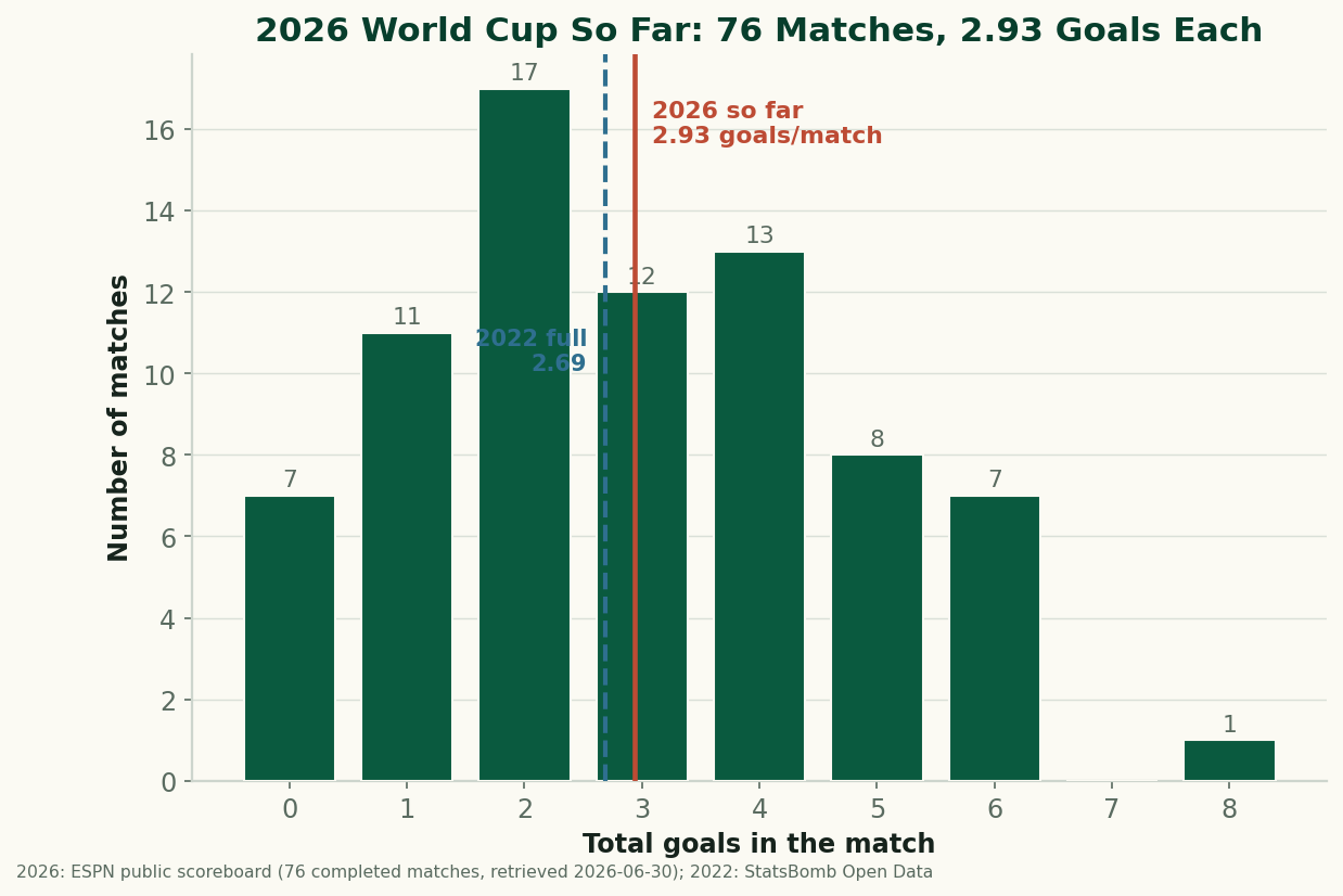
The 2026 World Cup So Far, By the Numbers: Just Under 3 Goals a Game
Through 76 completed matches, the 2026 World Cup is still outscoring 2022 — 2.93 goals a game to 2.69. After an early spike the rate has settled just under 3 a game. The real, sourced numbers on goals, draws, and the blowouts behind them, with honest caveats about a group-stage-only sample. (A living snapshot, refreshed as games are played.)
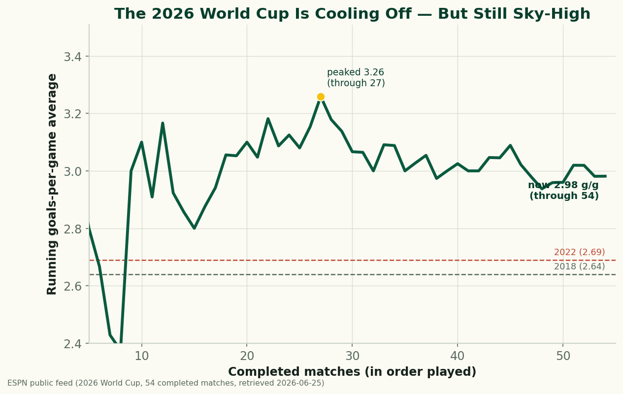
The 2026 World Cup Is Cooling Off — and Still the Highest-Scoring in Generations
Through 54 completed matches, the 2026 World Cup is averaging 2.98 goals a game — down from a blistering 3.26 early on, but still comfortably above 2022 (2.69) and 2018 (2.64), and the highest-scoring World Cup since 1970. A refreshed look at where the goals are going as the group stage closes.
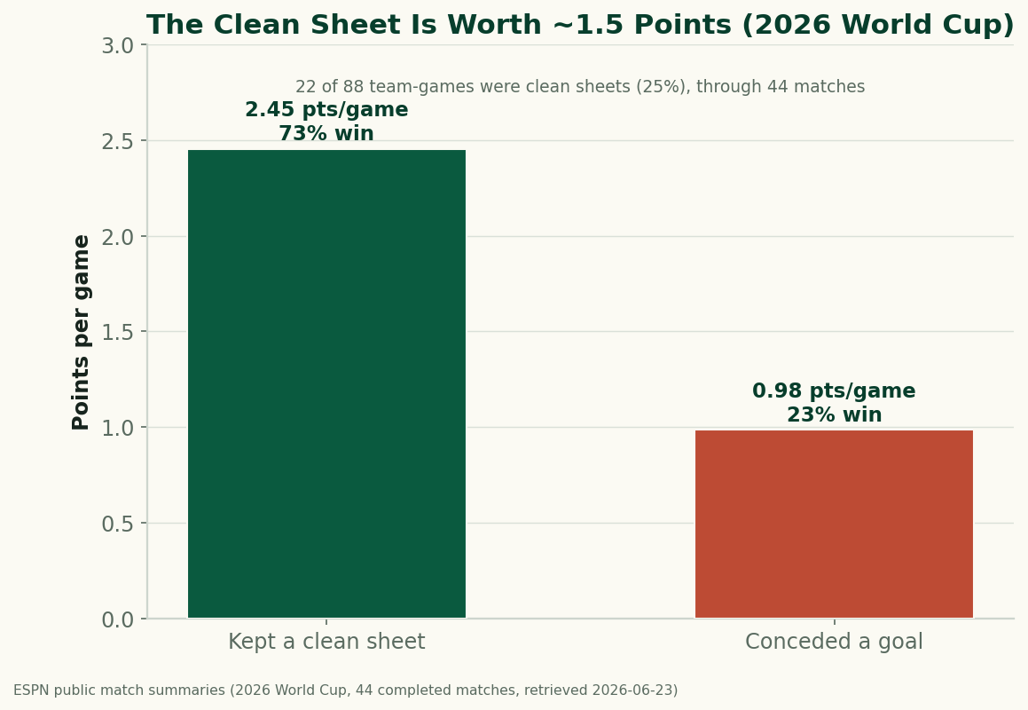
The Clean Sheet Is the Most Valuable Thing at the 2026 World Cup
Through 44 completed matches, a team that keeps a clean sheet at the 2026 World Cup averages 2.45 points and wins 73% of the time; a team that concedes averages under 1. Don't concede and you almost can't lose — the data on what a clean sheet is worth.