Chart a Century of World Cup Goals in Python: Goals per Game, Year by Year
Plot the long arc of World Cup scoring - and learn to source the data honestly.
The World Cup has a scoring history with a clear, surprising shape. The early tournaments were goal-soaked free-for-alls; the modern game, for all its talent, is markedly stingier. Plotting goals per game by year reveals that arc in a single chart — the high-scoring 1950s, the defensive dip, the long plateau of the modern era. This tutorial draws that chart in Python with matplotlib. Just as importantly, it shows you how to source the underlying numbers honestly, rather than trusting a half-remembered figure or a chart with no citation.
The metric: goals per game
Total goals at a World Cup is the wrong number to compare across history, because the tournaments are different sizes. The 1930 edition played 18 matches; recent ones played 64; the 2026 tournament will play 104. A tournament with more matches racks up more total goals almost by definition. The fair comparison is goals per game — total goals divided by total matches — which strips out tournament size and leaves a clean measure of how freely teams scored.
The format expansion is itself a story worth knowing: the jump to 48 teams and 104 matches is unpacked in why 104 matches and a 48-team format. For this chart, the takeaway is simply that you must normalise by matches, or 1930 and 2022 are not on speaking terms.
Sourcing the data honestly
This is the part most tutorials skip, and it is the most important. The goals-per-game figures are historical facts that live in well-maintained reference sources — principally the RSSSF archive and FIFA's own records. You should pull the full, authoritative series from one of those.
To keep this script runnable on its own, the code below seeds a handful of well-known anchor values — figures widely reported and useful as a sanity check — and explicitly leaves the rest for you to fill in from the source. Two honesty points follow from that, and they are not boilerplate:
import pandas as pd

# --- ILLUSTRATIVE ANCHORS ONLY -- NOT a complete/official dataset.
# A few widely-reported goals-per-game values to seed the chart and
# act as a sanity check. SOURCE THE FULL SERIES YOURSELF from RSSSF
# (https://www.rsssf.org/) or FIFA, and fill in every missing year.
# 2026 is intentionally absent: it has not been played.
goals_per_game = pd.DataFrame([
    # year, goals_per_game   (fill in the rest from the source!)
    (1930, 3.89),
    (1954, 5.38),   # the famous high-scoring outlier
    (1962, 2.78),
    (1990, 2.21),   # the famous low-scoring outlier
    (2014, 2.67),
    (2018, 2.64),
    (2022, 2.69),
], columns=["year", "goals_per_game"])

# TODO: add the years you are missing -- 1934, 1938, 1950, 1958,
# 1966, 1970, 1974, 1978, 1982, 1986, 1994, 1998, 2002, 2006, 2010 --
# using values from your chosen authoritative source.
print(goals_per_game)
If you want to compute these yourself rather than copy them, the arithmetic is trivial once you have each tournament's total goals and match count: goals divided by matches. RSSSF lists both per edition. Building the series from those two raw columns is the most defensible route, because then every point on your chart traces back to a primary count you can re-check.
Tidying the series
Whichever way you assemble it, a few tidy-up steps make the data plot-ready. Sort by year so the line runs left to right in time. Confirm the values are numeric, and — if you computed them — round sensibly. The point of doing this in pandas is that the same code works whether you have seven rows or the full two dozen.
goals_per_game = (goals_per_game
                  .sort_values("year")
                  .reset_index(drop=True))

# If you stored raw totals instead, derive the rate like this:
#   goals_per_game["goals_per_game"] = (
#       goals_per_game["total_goals"] / goals_per_game["total_matches"]
#   )

# Quick sanity bounds: World Cup scoring has historically sat
# between roughly 2 and 5.5 goals per game. Flag anything outside.
out_of_range = goals_per_game[
    (goals_per_game["goals_per_game"] < 1.5) |
    (goals_per_game["goals_per_game"] > 6.0)
]
if not out_of_range.empty:
    print("Check these unusual values:\n", out_of_range)
That range check is a cheap guard against the most common sourcing error — a transcribed total that is off by a tournament. Anything below 1.5 or above 6 goals per game across a whole World Cup would be historically unprecedented and almost certainly a typo.
Drawing the chart
Now the payoff. A line plot of goals per game against year shows the long arc directly. We mark each tournament with a point, label the axes, and draw a reference line at the all-time average so the high- and low-scoring eras read at a glance.
import matplotlib.pyplot as plt

fig, ax = plt.subplots(figsize=(9, 5))

ax.plot(goals_per_game["year"], goals_per_game["goals_per_game"],
        marker="o", color="#1f4e79", linewidth=2)

# Reference line: the mean across the years you have.
mean_gpg = goals_per_game["goals_per_game"].mean()
ax.axhline(mean_gpg, color="grey", linestyle="--", linewidth=1)
ax.text(goals_per_game["year"].min(), mean_gpg + 0.05,
        f"mean of plotted years ({mean_gpg:.2f})", color="grey")

ax.set_xlabel("World Cup year")
ax.set_ylabel("Goals per game")
ax.set_title("World Cup goals per game by year\n"
             "(illustrative anchors -- complete the series from RSSSF/FIFA)")
ax.set_ylim(0, 6)
fig.tight_layout()
plt.savefig("world_cup_goals_per_game.png", dpi=120)
plt.show()
The chart title carries the caveat into the image itself, so the figure can never be mistaken for a finished, fully-sourced dataset when it is screenshotted out of context. That is a small habit worth keeping for any chart built on partial data.
Annotating the eras
A bare line invites the question "so what?" Annotations answer it. With matplotlib's annotate you can point directly at the landmarks: the 1954 spike, still the highest-scoring World Cup on record, and the defensive trough around 1990, the lowest. The contrast between them frames the whole modern-era story — scoring fell sharply from the early decades and has since settled into a remarkably stable band.
# Annotate the two famous extremes (only if present in your data).
labels = {1954: "1954: highest on record",
          1990: "1990: defensive low"}

for year, text in labels.items():
    row = goals_per_game[goals_per_game["year"] == year]
    if not row.empty:
        y = float(row["goals_per_game"].iloc[0])
        ax.annotate(text, xy=(year, y),
                    xytext=(year, y + 0.6),
                    ha="center", fontsize=9,
                    arrowprops=dict(arrowstyle="->", color="black"))

fig.savefig("world_cup_goals_annotated.png", dpi=120)
Run the full script and you have a publishable chart of the long arc of World Cup scoring — once you have replaced the anchors with the complete series. The reason that arc bends the way it does — better defending, fitter athletes, tactical caution at the knockout stages — is the kind of question World Cup 2026 by the numbers takes up, setting recent tournaments against the historical baseline this chart makes visible.
Where this can mislead
Two honest caveats. First, goals per game is a tournament-wide average, and it hides structure: group stages tend to be more open than knockouts, and a single rout can lift a whole edition's figure. Second — the one this tutorial has hammered — a chart is only as trustworthy as its source. The anchors here are a scaffold to get the code running, not a dataset to cite. Pull the full series from RSSSF or FIFA, check it against the raw match counts, and only then read meaning into the shape. The 2026 point, in particular, cannot be plotted until the tournament is played.
Sources & further reading
- Free textbook: Chapter 5: Introduction to Soccer Metrics — the theory behind this, at DataField.dev.
- RSSSF — the Rec.Sport.Soccer Statistics Foundation, the standard archive for historical World Cup totals and match counts.
- FIFA — official tournament records and statistics for every World Cup edition.
- SciPy / NumPy documentation — reference for the numerical tooling behind pandas.
- FBref — competition histories useful for cross-checking figures.
More from World Cup 2026
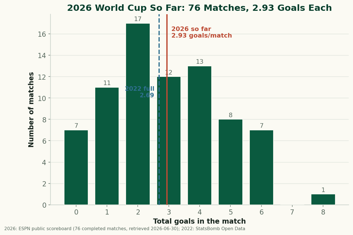
The 2026 World Cup So Far, By the Numbers: Just Under 3 Goals a Game
Through 76 completed matches, the 2026 World Cup is still outscoring 2022 — 2.93 goals a game to 2.69. After an early spike the rate has settled just under 3 a game. The real, sourced numbers on goals, draws, and the blowouts behind them, with honest caveats about a group-stage-only sample. (A living snapshot, refreshed as games are played.)
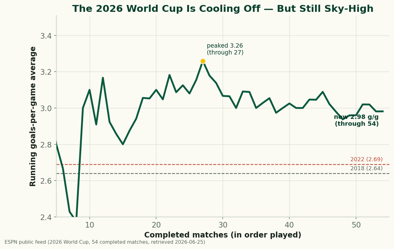
The 2026 World Cup Is Cooling Off — and Still the Highest-Scoring in Generations
Through 54 completed matches, the 2026 World Cup is averaging 2.98 goals a game — down from a blistering 3.26 early on, but still comfortably above 2022 (2.69) and 2018 (2.64), and the highest-scoring World Cup since 1970. A refreshed look at where the goals are going as the group stage closes.
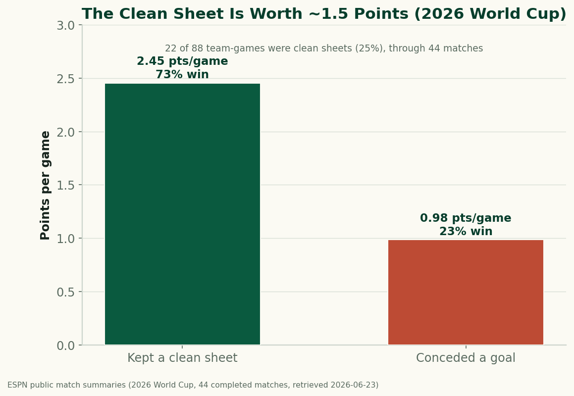
The Clean Sheet Is the Most Valuable Thing at the 2026 World Cup
Through 44 completed matches, a team that keeps a clean sheet at the 2026 World Cup averages 2.45 points and wins 73% of the time; a team that concedes averages under 1. Don't concede and you almost can't lose — the data on what a clean sheet is worth.