Reading a World Cup Shot Map: Dots Sized by Danger
A quick visual guide to the most useful graphic in football analytics.
A shot map is the single most information-dense graphic in football analytics, and once you can read one, a ninety-minute match collapses into a picture you can take in at a glance. Every shot becomes a dot; the size of the dot is the danger of the chance; the position is where it was taken. At a World Cup, where a single result decides a nation's fate, a shot map is how you see past the scoreline to whether the result was actually deserved. Here is how to read one.
What the circles mean
A shot map plots one circle for every shot in a match, positioned on the pitch exactly where the shot was taken. That much is intuitive. The crucial detail — the thing that turns a scatter of dots into real information — is the size of each circle: the bigger the circle, the higher the xG of that shot.
Expected goals, remember, is the probability that an average finisher scores from a given chance. So a big circle is a high-probability chance: a close-range shot, a clear sight of goal, the kind of opportunity that goes in often. A penalty shows up as one of the largest circles on the map, worth around 0.79 in most public models. A tiny circle is a low-probability effort: a speculative drive from distance, a shot squeezed in from a tight angle, the kind of attempt that rarely beats the keeper. By sizing the dots this way, the map shows you not just how many shots a team had, but how good those shots were — which is the difference that actually matters.
Two more conventions you'll see on almost every shot map. The two teams are split by colour or by side of the pitch, so you can read each attack separately. And goals are marked distinctly — a filled circle, a star, a heavier outline — so you can see at a glance which chances actually went in versus which were created and missed. That last distinction is where the deserved-result story begins.
Reading the position: where the shots came from
Location is doing quiet work on a shot map, because in football, where a shot is taken predicts how likely it is to score better than almost anything else. The closer to goal and the more central the position, the higher the xG — which is why the biggest circles cluster in and around the six-yard box and the penalty spot, and the smallest ones sit out toward the edge of the area and beyond.
This means the shape of a team's dots tells a story on its own. A cluster of shots from central positions inside the box is the signature of a side genuinely breaking down a defence — getting into the dangerous zones and shooting from them. A spray of shots from outside the area, even if there are many of them, is the signature of a team that could not find a way through and resorted to hopeful efforts from range. The first pattern produces goals; the second mostly produces saves and blocks. Two teams can have the same shot count and utterly different maps, and the position of the dots is what separates them.
The patterns to look for
Once you can read size and position together, a handful of recognisable patterns jump out of any shot map. These are the ones worth knowing.
Territory without quality. One team's half of the map is crowded with dots — lots of shots — but they are all small circles from distance and tight angles. This is the classic picture of a side that dominated possession and territory but never created a genuinely dangerous chance. The shot count flatters them; the xG, visible in the tiny circles, exposes the truth. A team can have eighteen shots and a worse map than an opponent with six.
Few shots, big circles. The opposite pattern: one team has only a handful of dots, but they are large and central. This is a side that was clinical or counter-attacking — not shooting often, but shooting from excellent positions when it did. A map like this often belongs to the team that won despite "being outshot", and it explains why the scoreline went the way it did.
The deserved win. When one team's circles are bigger and more central than the other's, and the goals (the marked dots) line up with the side that created the better chances, you are looking at a deserved result. The map and the scoreline agree. These are the comfortable reads — the better team created more danger and won.
The smash-and-grab. The most revealing pattern of all: one team's map is full of big central circles, but the marked goals belong to the other team — the one with the smaller, sparser dots. This is a side that created the better chances and lost anyway, beaten by clinical finishing or a goalkeeper having the night of his life. The shot map shows you a result the scoreboard got "wrong" in the sense that the run of play deserved a different outcome. At a World Cup, where one match ends a campaign, spotting a smash-and-grab tells you which losing team was actually closer to going through than the result suggests.
Deserved versus actual: what the map really reveals
This is the heart of why shot maps matter. A scoreline records what happened; a shot map records what the chances created point toward — the deserved result. Putting the two side by side is the most honest way to assess a match, and the shot map makes the comparison visual rather than abstract.
When the marked goals match the side with the bigger circles, finishing agreed with chance creation, and the result fairly reflects the play. When they diverge — big circles for one team, goals for the other — finishing or goalkeeping overrode the run of play, and the result, while it counts for the bracket, would not likely repeat. Over a season these divergences wash out. Over a single knockout tie they decide who goes home, which is exactly why reading the map rather than the score tells you more about which teams are genuinely playing well.
One honest limit: a pre-shot shot map shows the quality of chances created, not how well they were struck or saved. A team can be undone by a goalkeeper producing a string of brilliant stops against those big central circles — and that, too, is information, just a different kind. Grading the keeper rather than the chance is the job of post-shot xG, covered in post-shot xG and goalkeeper metrics. When a shot map screams "deserved win" but the scoreboard disagrees, an outstanding goalkeeping performance is often the reason, and PSxG is how you confirm it.
Make one yourself
Reading shot maps is a skill that compounds fast: the more you read, the quicker the patterns register, until a glance is enough. The best way to build that fluency is to make a few yourself, which is more approachable than it sounds. With free tools and free data, you can plot a shot map from a real match — including past World Cup matches — in a few dozen lines of Python. The step-by-step walkthrough in draw your first pass map and shot map with mplsoccer takes you from a blank file to a finished xG-sized shot map, and building one yourself teaches you to read them faster than any amount of looking ever will.
Once you can read a shot map at a glance, World Cup 2026 changes shape. A 1–0 stops being a flat fact and becomes a picture you can interpret — territory or quality, deserved or stolen, a goalkeeper's masterpiece or a striker's off night. For how this fits into watching the whole tournament through the underlying numbers, the guide to watching with xG puts the shot map in its wider context.
Sources & further reading
- Free textbook: Chapter 7: Expected Goals (xG) Models — the theory behind this, at DataField.dev.
- Draw Your First Pass Map and Shot Map with mplsoccer — build an xG-sized shot map from real match data in a few dozen lines of Python.
- Post-Shot xG and Goalkeeper Metrics — why a deserved win can still be lost to a goalkeeper, and how to measure it.
- How to Watch the World Cup with xG — fitting the shot map into a wider match-watching lens.
- StatsBomb open data — shot-by-shot data with xG and locations for past World Cups, the raw material for a shot map.
- StatsBomb — methodology on how shot xG values and event locations are recorded.
More from World Cup 2026
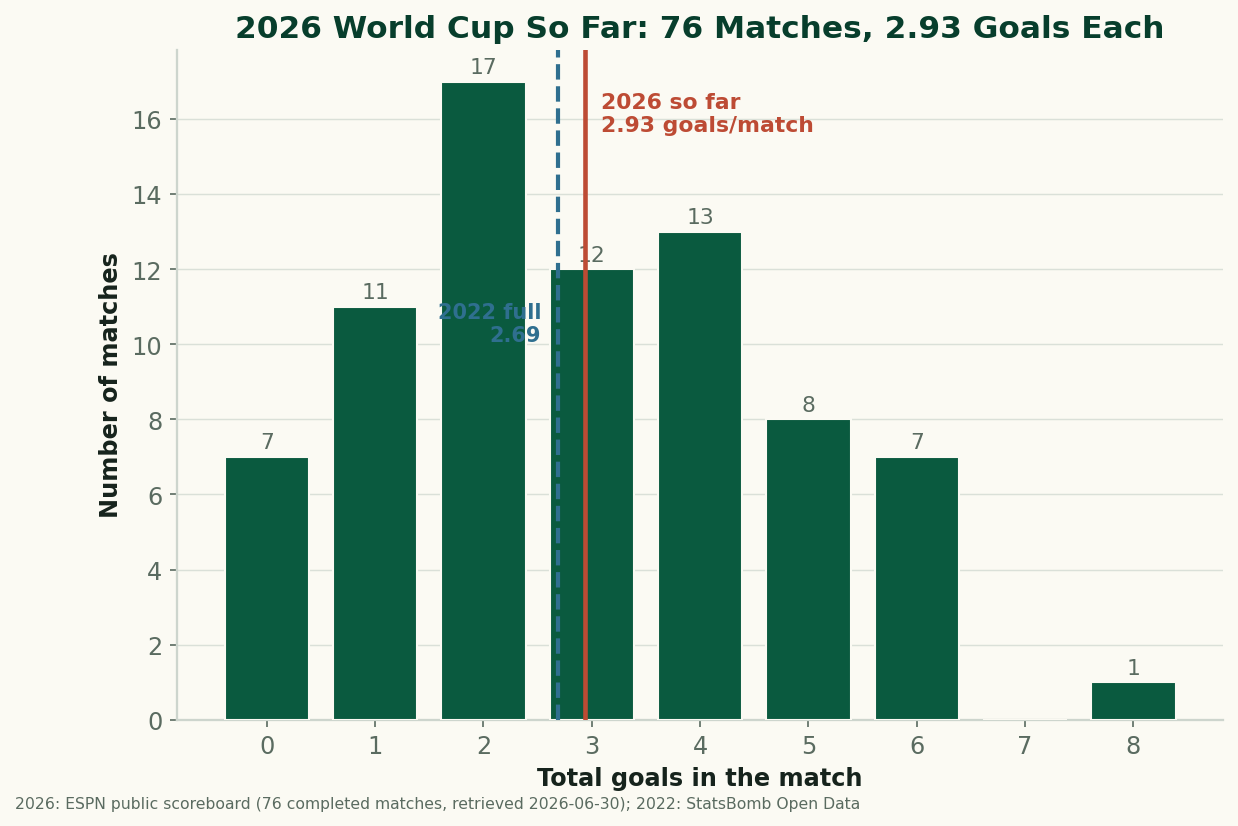
The 2026 World Cup So Far, By the Numbers: Just Under 3 Goals a Game
Through 76 completed matches, the 2026 World Cup is still outscoring 2022 — 2.93 goals a game to 2.69. After an early spike the rate has settled just under 3 a game. The real, sourced numbers on goals, draws, and the blowouts behind them, with honest caveats about a group-stage-only sample. (A living snapshot, refreshed as games are played.)
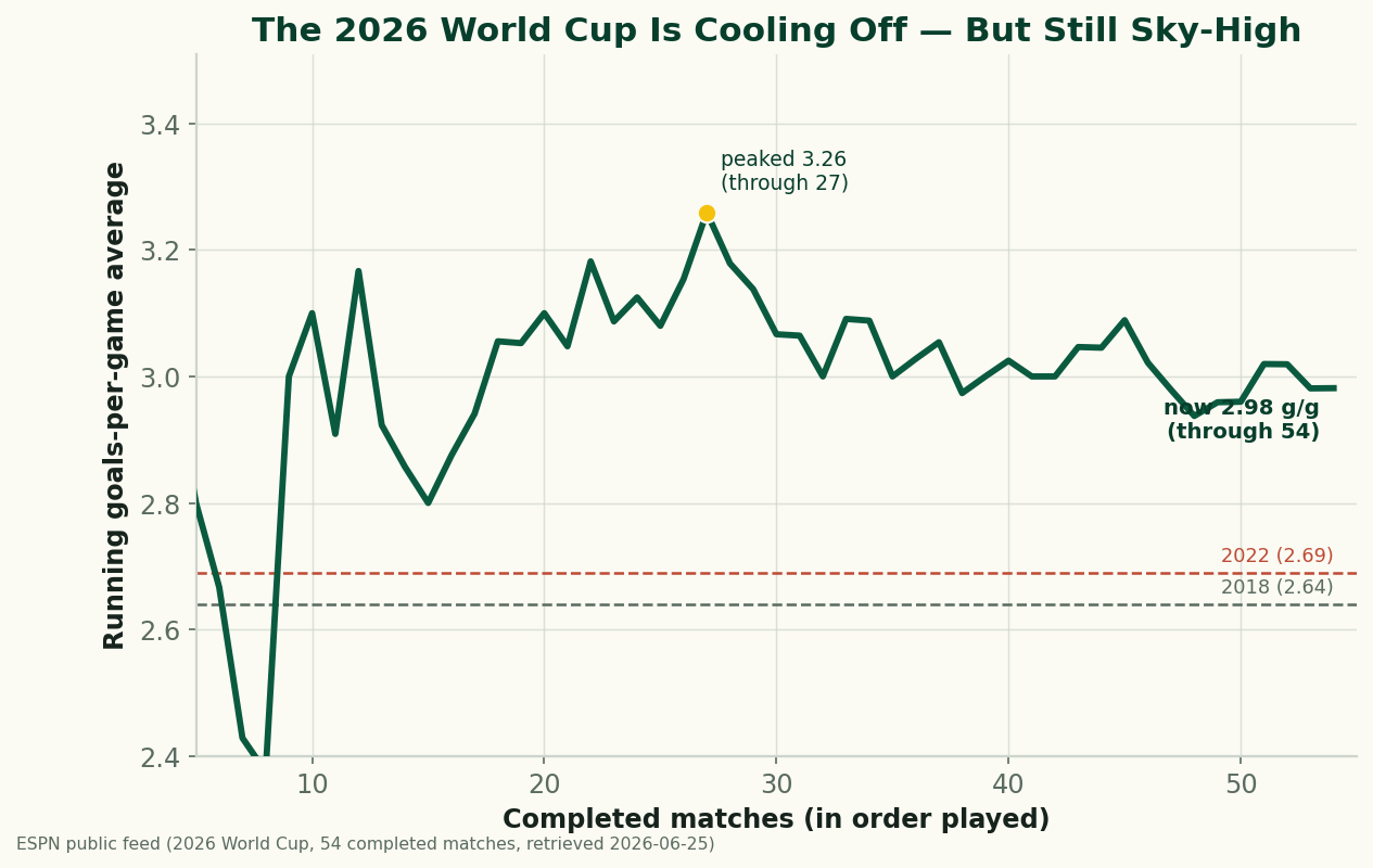
The 2026 World Cup Is Cooling Off — and Still the Highest-Scoring in Generations
Through 54 completed matches, the 2026 World Cup is averaging 2.98 goals a game — down from a blistering 3.26 early on, but still comfortably above 2022 (2.69) and 2018 (2.64), and the highest-scoring World Cup since 1970. A refreshed look at where the goals are going as the group stage closes.
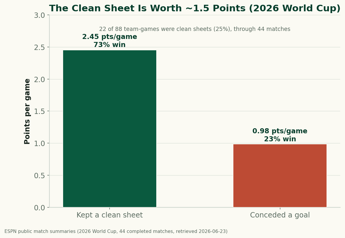
The Clean Sheet Is the Most Valuable Thing at the 2026 World Cup
Through 44 completed matches, a team that keeps a clean sheet at the 2026 World Cup averages 2.45 points and wins 73% of the time; a team that concedes averages under 1. Don't concede and you almost can't lose — the data on what a clean sheet is worth.