Game-State Effects on Stats: How the Scoreline Bends Possession, Shots, and xG
A field guide to score effects in the numbers you can actually get hold of.
Pull up the stat sheet from almost any match that ended in an upset and you will find a strange little lie hiding in it: the beaten favourite often "won" the possession, the shot count, sometimes even the expected goals. It is tempting to read those numbers as evidence the result was a fluke. It is usually wrong, because in most cases the numbers are not describing dominance at all — they are describing a team that fell behind and spent an hour chasing the game. The losing is what produced the gaudy totals, not the other way round.
The mechanism behind that inversion — how a scoreline rewires both teams' incentives, and therefore their statistics — is set out in game state and score effects, and we will not re-argue it here. This piece takes the mechanism as given and asks the practical question that follows it. Given the data you can actually get hold of, which is usually a full-match box score with no timestamps in it: how badly is each number contaminated, how do you tell, and what can you still safely say?
Rank your metrics by contamination
Not every number on the sheet is equally poisoned, and treating them as if they were is its own mistake. A rough ordering, worst first, is the single most useful thing to carry in your head.
- Possession share — worst. It is close to a pure function of who is chasing. A side protecting a lead concedes the ball deliberately, and a side chasing hoards it because it must, so the figure often reads as the scoreline in disguise. Treat a raw possession percentage as evidence about the score, not about control.
- Shot count — nearly as bad. The most robust regularity in this whole area is that trailing teams shoot more. A team that falls behind early will usually out-shoot its opponent over ninety minutes, which flatly inverts the folk reading of a shot count.
- Defensive volume — badly, and in the flattering direction. Tackles, interceptions, clearances and blocks all rise for the side that spends the game defending a lead. A big defensive tally is a statement about how much defending a team had to do, not how well it did it.
- Pressing rates — badly, and in both directions at once. A full-match PPDA averages a desperate late press together with a comfortable early stand-off, then reports the mean as if it were a style.
- Expected goals — contaminated, but less. xG is summed over shots, and the trailing team takes more of them, so a side can lose and still "win" the xG by pouring forward for an hour and stacking up half-chances. It survives better than a raw shot count because it discounts the low-value attempts score effects generate most of — but it is not immune. (For what xG does and does not claim in the first place, see expected goals explained.)
- Per-shot quality — the most robust thing on the sheet. xG per shot, shot distance, the share of attempts from inside the box: these are ratios, and score effects inflate numerator and denominator together. They still drift, because a chasing team shoots from worse positions, but they do not swing by a factor of two the way volume does.
The ordering is not arbitrary. Score effects are overwhelmingly a volume distortion: they change how many events each team generates far more than they change the quality of a typical event. So the closer a metric sits to a raw count, the less you should trust it; the closer it sits to a per-event rate, the more you can.
Spotting the distortion without event data
Timestamped, scored event data lets you split any metric by game state directly, and if you have it, do that. Most people do not. Here is what a match log and a scoreline will still buy you.
Read the score first, deliberately. Cover the stat line, look at the result and the goal times, and predict the box score before you look at it. If your prediction lands — trailing team with more of the ball and more shots — then the box score has told you nothing the scoreline had not already told you, and it cannot be used as independent evidence about anything.
Use the goal times as a crude split. A match whose first goal arrives in the 84th minute is nearly uncontaminated: the two sides played level for the whole meaningful sample. A match settled in the ninth minute is almost entirely score effect. Sorting a set of matches by the minute of the opening goal is a poor substitute for a proper game-state control, and it costs nothing.
Prefer first halves. More of the average first half is played level than the average second half, so first-half splits — which several public sources publish — are systematically less contaminated than full-match ones.
Watch for the tell-tale mismatch. High possession with low xG per shot is the signature of a side that was behind and shooting from wherever it could. Strong xG per shot on modest volume is the signature of a side that was ahead and picking its moments. Neither is a verdict; both are a prompt to go and check the scoreline.
Season profiles are contaminated too
The trap does not stop at one match. Aggregate a season and the score effects do not conveniently average out, because a team's game states are not randomly distributed: good teams lead a lot and bad teams trail a lot. A relegation-threatened side accumulates a whole season of chasing, and its season-long possession, shot and xG totals inherit every minute of it.
The shape of the problem is easier to see laid out. The figures below are invented to illustrate the structure, not measured from any real team.
| Game state | Share of minutes | Possession | Shots per 90 | xG per shot |
|---|---|---|---|---|
| While level | 45% | 50% | 12 | 0.11 |
| While ahead | 20% | 42% | 9 | 0.14 |
| While behind | 35% | 61% | 19 | 0.07 |
| Season, all minutes | 100% | 53% | 14 | 0.09 |
The bottom line describes a possession-dominant, shot-heavy team. The splits describe a side that is roughly average when the game is even and spends a third of its season chasing. Nothing in the season row is false, exactly — it is an honest weighted average across three different versions of the same team, weighted by how often this one was losing. Leave everything about how they play untouched and simply give them better luck in front of goal, and every headline number in that bottom row moves. Downwards.
Notice which column moves least. Possession swings nineteen points across the splits and shots per 90 more than doubles, while xG per shot stays inside a band you could plausibly call the same team playing the same way under different pressure. That is the contamination ranking from the previous section, visible in one table.
Three misreadings this produces
The unlucky-dominance story. "They had 65% of the ball and eighteen shots and lost — football is cruel." Often the dominance is downstream of the deficit, and the cruelty is imaginary.
The style misattribution. A team gets labelled possession-based, or direct, on the strength of season totals that mostly record how often it was behind. Coaches end up credited with philosophies their results manufactured.
The improvement mirage. A side starts winning, spends less time chasing, and its possession and shot volume fall. Read without game state, that looks like decline arriving alongside better results, and somebody writes that the team is riding its luck.
What to do when all you have is the full-match total
Sometimes no split is available and you still have to say something. Three honest options, in order of preference.
Switch to a ratio. Ask what the shots were worth rather than how many there were. Per-shot and per-possession rates carry far less of the scoreline than counts do.
Aggregate over enough matches that the game states vary. A single match has one scoreline path; twenty matches have twenty. They are not independent of team strength, but the distortion at least stops being a single unknown constant.
State the contamination out loud. "They out-shot the opponent 18–9, though they trailed from the ninth minute" is a complete and honest sentence. "They out-shot the opponent 18–9" is not, and the missing clause was doing all the work.
The one thing not to do is the common thing: quietly treat the total as a measurement of quality and then argue from it. Score-state-adjusted models exist precisely because that argument fails so often. They build the scoreline into the weighting, so a shot taken at 2–0 down is not counted the same as one taken at 0–0 — the same instinct behind possession-adjusting defensive numbers so that sheer volume of opportunity cannot masquerade as quality, machinery covered in possession-adjusted stats.
Where the correction stops working
Adjusting for game state is not free, and it is worth knowing where it runs out.
Splitting by state shrinks every sample it touches. A "while level" figure from a single match can rest on twenty minutes of football, and the noise in it will swamp the bias you just removed. Game state is also entangled with team strength rather than independent of it: strong teams lead more, so "while ahead" numbers are disproportionately strong teams' numbers, and comparing states across teams quietly compares different populations. And the state itself is a simplification — one goal up with eighty minutes left and one goal up with three left are not the same instruction to a coach, which is why the more careful models weight by time remaining as well as by margin.
None of that is an argument for going back to raw totals. It is an argument for the habit this piece is really about: read the scoreline first, know which numbers it bends hardest, and put that in the sentence. It matters most in exactly the places people quote box scores hardest. A favourite that scores early and sees the game out in second gear can post modest totals and still have been comfortably the better side; a team eliminated after chasing three group games from behind can leave a tournament with flattering aggregate numbers. Reading those sheets without the scoreline attached would invert several of the real stories in the site's World Cup coverage.
The contamination also propagates upward. A projection model fed raw shot or possession totals inherits every distortion above: it over-rates sides that spend their seasons behind piling up empty volume, and under-rates efficient front-runners who score early and defend. How different forecasters handle that context is one concrete reason two reputable projections of the same competition can disagree, a theme picked up in why league projection models disagree.
Sources & further reading
- Game state and score effects — the companion piece: why the scoreline changes how both teams play in the first place.
- StatsBomb — analysis and methodology on score effects and game-state splits.
- StatsBomb open data — event data timestamped and scored, so events can be bucketed by game state.
- Understat — match and season xG data for the major European leagues.
- FBref — match logs and advanced stats, including first-half splits, useful for reducing score-effect contamination without event data.
More from Stat Explainers
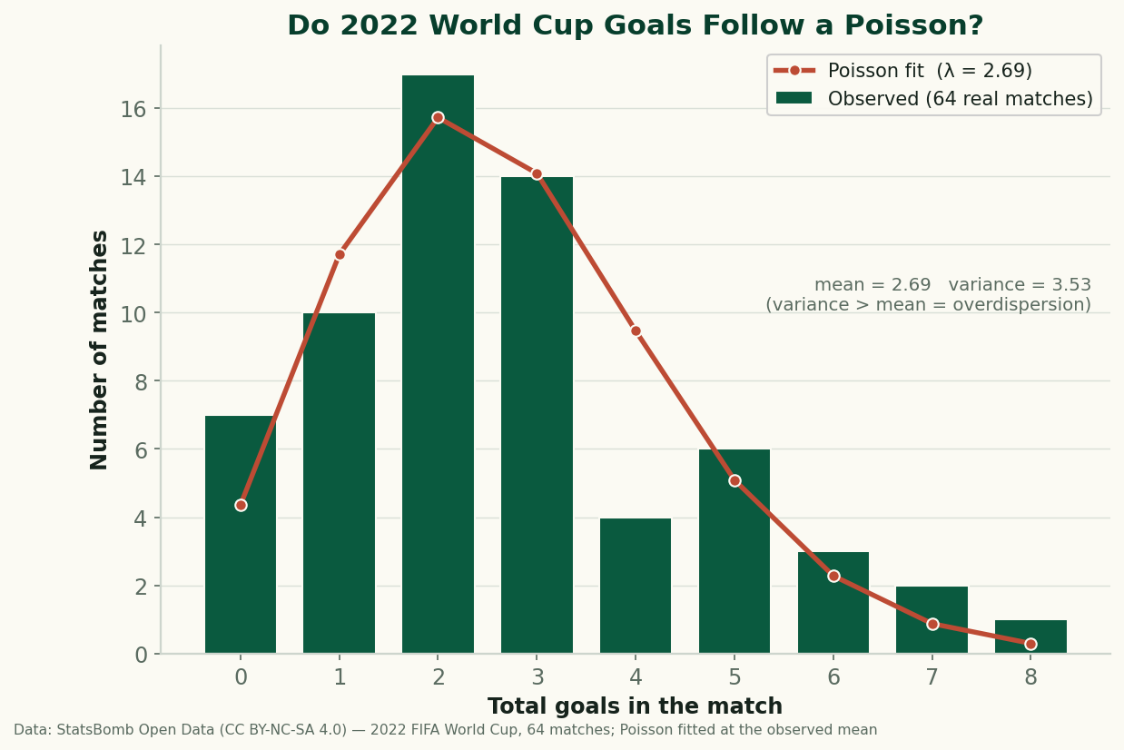
Do Football Goals Follow a Poisson? Testing the Standard Model on All 64 Games of 2022
Every scoreline prediction in football rests on the Poisson. We fit it to all 64 games of 2022 — it gets the shape right, but real goals are overdispersed.
Aerial Duels and Heading Data: Reading Win Rate Without Getting Fooled by Volume
Aerial-duel win percentage, why raw counts mislead, and where aerial dominance actually matters — set pieces, target men, and defending crosses.
Expected Points (xPts): Turning Shot-Level xG Into a Fairer Table
Expected points (xPts) simulates a match from its shot-level xG to get win, draw and loss odds — points that reward chances created, not goals that went in.