Does xG Actually Work? Big Chances vs Long Shots at the 2022 World Cup
Sort 1,430 shots by xG and the model mostly tells the truth — long shots stay cheap, big chances go in more than half the time, and World Cup finishers beat the model by a hair.
Expected goals is a model, not a measurement, and the right way to test a model is not to argue about it — it's to check its calibration. If xG says a shot is worth 0.10, then a big pile of shots worth 0.10 should go in about 10% of the time. So I took every non-penalty shot from the 2022 World Cup — 1,430 of them, producing 152 goals against a total expected-goals figure of 137.9 — sorted them by their xG value, and asked whether each band converted at the rate the model predicted. The headline: it basically does. The bars track closely from the cheapest long shots to the fattest big chances, with World Cup finishers beating the model by about 10% overall. xG is not fooling anyone.
Sourcing. Every shot, and every xG value, comes from StatsBomb's free open data covering all 64 matches of the 2022 World Cup, bundled here as data_layer/wc2022_shots.json. Penalties are excluded throughout (more on why below). Nothing is hand-entered or invented.
The exhibit: predicted vs actual, band by band
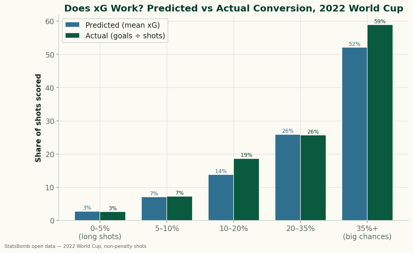
Read the chart band by band and the pattern is reassuring. The lowest band, shots with under a 5% chance, was predicted to score 2.8% of the time and actually went in 2.6% — effectively a dead match across 684 shots, which is by far the biggest bucket, because most shots in football are low-value. The 5–10% band predicted 7.0% and delivered 7.3% over 371 shots. The 10–20% band ran a little hot: 13.8% predicted, 18.7% actual over 193 shots. The 20–35% band landed almost exactly on the line, 25.9% predicted against 25.7% actual over 109 shots. And the top band — the “big chances” at 35% or higher — predicted 52.1% and actually scored 58.9% across 73 shots. That is what good calibration looks like: the predicted and actual bars sit on top of each other, with actual nudging slightly above in most bands, exactly the signature you'd expect from a set of finishers who collectively beat the model.
A worked example: what 73 big chances are really worth
Let me make the calibration concrete, because the arithmetic is the whole point. Take the top band, the 73 shots the model rated at 35% or better. Their mean xG was 0.521. Multiply that by 73 shots and the model expects roughly 38 goals (0.521 × 73 ≈ 38). The players scored 43 — a 58.9% conversion rate. So the model said “about 38” and reality said 43: close, with the finishers a touch ahead. That is the right comparison to make, and it's worth being explicit about why. Each individual shot has its own xG, but no single 0.52 shot “should” score 52% of the time in a way you can ever check — it either goes in or it doesn't. Calibration only has meaning in aggregate, which is why you take the mean xG of the band (the model's average prediction for those shots) and compare it to the band's actual goals-over-shots. Predicted total versus actual total, on a big enough pile to be meaningful.
Now contrast the bottom of the distribution. The 0–5% band held 684 shots — nearly half of everything — and they produced just 18 goals, a 2.6% rate. That is the unglamorous truth a shot map makes visible: a long shot from distance, or a half-chance squeezed in from a tight angle, is almost always a wasted possession. The model knows it, and the scoreboard agrees. The practical translation is blunt: a “big chance” in the 35%+ band really is a coin flip or better, while a shot under 5% is, on average, very nearly a giveaway. If you want a feel for what those shots look like spatially, the shot-map explorer plots them on the pitch, and our piece on reading a World Cup shot map walks through how location drives these values.
What xG is, and why mean-xG-per-band is the fair test
If you're new to the metric, our expected goals explainer is the long version, but the short version is this: xG assigns every shot a probability of becoming a goal based on the features of the chance — distance, angle, body part, the type of pass that created it, whether it was a header, and so on — learned from a huge historical sample of shots. A shot's xG is the model's best estimate that this kind of shot scores. That's exactly why calibration is the honest test. You don't grade xG by whether it “called” any one goal; you grade it by whether shots it rated at, say, 25% actually score about 25% of the time when you gather enough of them. The 20–35% band doing 25.7% against a predicted 25.9% isn't luck cancelling out — it's the model being well-built. Across the whole tournament the same logic gives the topline: 137.9 expected goals, 152 actually scored, an overperformance of +14.1 goals, about 10%. World Cup squads, stacked with elite finishers, beat an average-quality model by a hair — and you can see that same hair as the small gap between actual and predicted in most bands above.
What this does and doesn't prove
Calibration this clean is a genuine endorsement of xG, but I want to be honest about the edges:
- One tournament, and small samples up top. The big-chance band is only 73 shots, and the 10–20% band only 193. The overperformance could be partly variance, or partly selection — World Cups concentrate elite finishers, so the population finishing these chances is better than the population the model was trained on.
- The model may be calibrated to club football, not World Cups. StatsBomb's xG is learned largely from club-level data. International tournament shots aren't guaranteed to behave identically, and the steady +10% could reflect exactly that mismatch rather than pure luck.
- Calibration is not correctness on any single shot. A well-calibrated model can still be “wrong” about every individual chance — it only promises to be right on average. xG is a description of shot quality, not a prophecy about a given strike.
- Penalties are excluded. A penalty is worth about 0.78 xG and converts around three-quarters of the time; left in, they'd flood and dominate the top band and tell you nothing about open play. Stripping them out is what makes the bands comparable.
- xG ignores context. It doesn't know the score, the minute, the fatigue, or the defender breathing down the shooter's neck. Game state and pressure move real conversion in ways a static shot-quality model can't see — see post-shot xG and goalkeeper metrics for the part of finishing that happens after the ball leaves the boot.
None of that overturns the chart. It just means the right reading is “xG is well calibrated here, and these finishers beat it slightly,” not “xG is perfect.” If you want to chase down who, specifically, did the overperforming, that's the subject of who overperformed xG at the 2022 World Cup, and the body-part split — why headers and feet finish so differently — is in headers vs feet.
Reproduce it
The recipe is simple enough to run yourself. Load every non-penalty shot from data_layer/wc2022_shots.json, bucket each one by its xg value into the five bands (0–5%, 5–10%, 10–20%, 20–35%, 35%+), and for each band compute two numbers: the mean xG (the model's predicted conversion) and goals divided by shots (the actual conversion). Plot them side by side. The whole thing — bands, counts, and the chart — is recomputed by charts/chart_wc2022_xg_buckets.py. No network at build time, nothing hand-typed.
Sources & further reading
- Free textbook: Chapter 7: Expected Goals (xG) Models — the theory behind this, at DataField.dev.
- Shot data and the xG model: StatsBomb open data, all 64 matches of the 2022 World Cup, bundled as
data_layer/wc2022_shots.jsonand charted bycharts/chart_wc2022_xg_buckets.py. Data provided by StatsBomb. - Concept: model calibration — grading a probabilistic model by whether predicted rates match observed frequencies in aggregate, the method used throughout this piece.
- Related: Expected goals explained, who overperformed xG in 2022, and headers vs feet finishing.
More from Data Deep-Dives
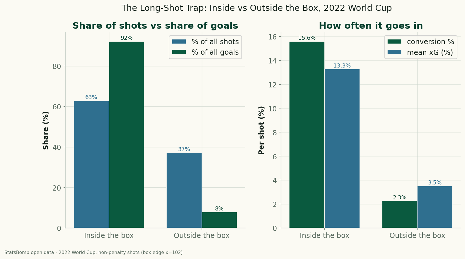
The Long-Shot Trap: Inside vs Outside the Box at the 2022 World Cup
Using StatsBomb data for all 64 matches of the 2022 World Cup, shots from outside the penalty box were 37% of all attempts but produced just 8% of the goals — a 2.3% conversion rate against 15.6% from inside. The data behind 'stop shooting from there.'
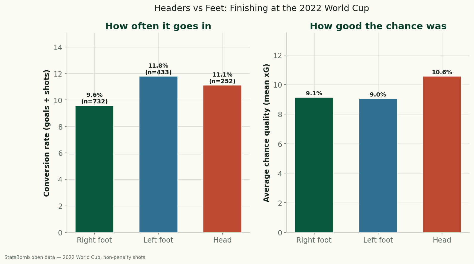
Headers vs. Feet: Which World Cup Shots Actually Go In?
Using StatsBomb data for all 64 matches of the 2022 World Cup, headers and feet convert at almost the same rate (11.1% vs 10.5%) — but only because headers come from higher-quality positions. Relative to chance quality, foot finishing beat the model, and the left foot was the most clinical of all.
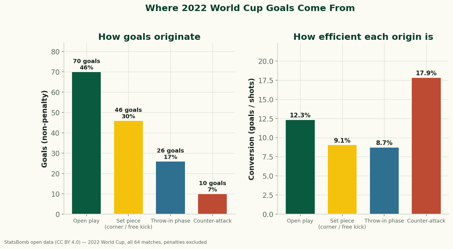
Set Pieces, Open Play, and Counters: Where 2022 World Cup Goals Came From
Using StatsBomb's data for all 64 matches of the 2022 World Cup, we trace every goal back to how the possession began. Set pieces (corners and free kicks) originated 30% of non-penalty goals; open play 46%; and counter-attacks, though rare, converted at 17.9% — nearly double the open-play rate. Where goals really come from.